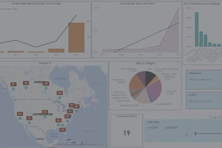
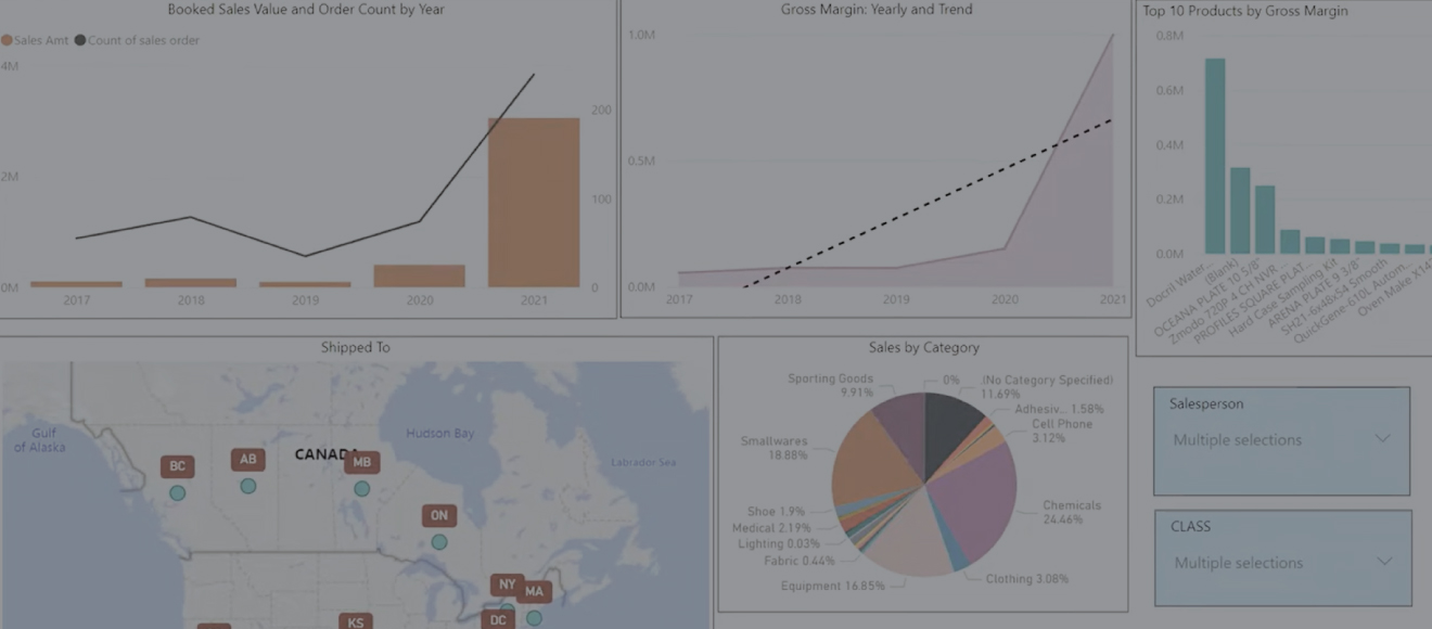
With Blue Link ERP, you can gain insight into your data and drill down into important information using Microsoft Power BI. Power BI dashboards highlight metrics like sales value, gross margins, geographic data, and product rankings, updating dynamically as filters are applied.
Transcription
0:08 Power BI from Microsoft is a very powerful dashboard reporting and business intelligence tool, and it works very nicely with Blue Link ERP.
0:18 You can use Power BI visualizations to get graphical or tabular information about our data and to gain insights into how a business is doing.
0:28 We have various different ways of presenting the information and looking at different slices of data over different periods of time. Power BI will also allow you to drill down to more details. Let’s take a little bit of time to look at some of the things on this little sample Power BI set of dashboards.
0:44 On the first dashboard we have a mixture of graphs and charts that deal with set booked sales value, gross margins, it ranks our products by top ten, it shows geographically where we’re selling data and breaks it down by categories.
0:58 Selection criteria are based on these three little blue graphics which are called sliders and they allow us to determine: Are we including all salespeople or just some salespeople? Do we want to include all of our product classes or maybe we want to simply eliminate some of them, and you’ll notice that as I do that all of the graphics on the screen update in real time at the same time, so I’ll turn those on again. And also, we’ve got a slider and data entry points for the period of time that we want to report over.
1:28 Also on the graphics themselves, they have the ability to click on any particular element to filter all of the graphics and all of the information on the screen down to that. So, for example, this is a book sales by year. If I click on the 2020 tile, the entire rest of the screen updates to only show us 2020 data. And if I click on it again, it updates to show us everything.
1:51 Similarly, if I click on smallware’s in this pie chart, it will show shadow information on some of the charts for the data it’s excluded but it will highlight the selected category.
2:04 That map graphic is an interesting one because it allows you to zoom in and zoom out to look at different details, and it is drillable. We set this one up as a dribble one which you can see by little graphic over here. If I turn off drill down I can for example hone in on, let’s say Massachusetts and double click on that. It now shows me where in Massachusetts these sales have been made. Turns out they’re all in the Boston area. And then I can always just jump back up one level by jumping out of that drill down. We’ll see more of that in a couple of moments.
2:33 On the next page, we’ve seen different visualizations of data, including things like our top 10 products, this time ranked by gross margin. We’re also seeing an unusual kind of variation of a pie chart showing us gross margin by different product categories and the same things apply here. If I click on smallware’s, the rest of this graphic updates to only show me data regarding smallware’s. We have a slider here to date selection, which in this case is asking or is showing us the last three calendar years.
3:02 So what we can do in addition to that is with some of these graphics we can drill down. So if we want to look at some of the information, the details behind these $1.3 million sales for Black Eyed Pea restaurants. I can go ahead and drill by customer and go to a different graphic that shows me for that customer for that same period the last three years: What was the sales by month stacked by category. So, we can see from a seasonal perspective, this customer seems to really buy very heavily just as we head into the summer a little bit more in the fall and not that much through the thick of winter and spring.
3:40 We can also see the sales by class and the same tools apply here once again. If you click on equipment, it’s now highlighting just equipment sales. Click on the back button to go back to the graphic that I was at.
3:51 A third variation combines tabular information with graphics by using these data bars to highlight the bigger and smaller numbers. In this case, we’re actually using a slider to limit the data to the last 48 months, but we can change that. If I change that to the last 60 months, then the data updates immediately to reflect that. Also, on this particular map. We now have also drillable. If we drill in on, for example, the United States just by double clicking, we can now see graphically where the sales are spread in the United States and if we drill down into, say, the Florida area, Florida Georgia, Southwest will see that it’s mostly Atlanta actually not Florida and again we can always just back up and back up.
4:36 Power BI provides some very unique visualizations and in my experience this one called the decomposition tree is one of the most unique. It allows you to break down any starting number or any starting amount into different segments based on what you’re looking for. So, let’s just demonstrate and click on the plus sign and we get a list of a few different ways we can break this down. So, let’s say we want to break this down by year ordered. It is now showing us graphically and with dollar values which years would have been our best years. Clearly 2021 was our best year. There is another plus sign next to these. So, what we can do is we can say well 2021 was a good year, what categories were the most popular and now it will break this out by categories showing us again in descending order most valuable category at the top and we can take that further.
5:28 This one where there’s no category is a little bit suspicious. So why are we sending things with no category? Well, let’s have a look and see what the inventory class was behind those ones. We can see this was almost all equipment and clearly, we have a bunch of equipment that we haven’t really categorized but were part of our sales.
5:45 Now, this is great, and you can actually rewire this however you like. So, for example, if you want to get rid of the category and just take this out, and now it will jump back to showing us by year order what the classes were. Then of course we can break out from there and say show me the cities in which we sold those products.
6:03 Also, if we’re really interested in trying to understand what, for example, which cities food was sold in, we don’t have to go back and undo things, we can simply rewire this graphic. And we do that simply by clicking on, in this case, the food class and it now transfers the third break out the city break out to the food class. Similarly, if we wanted to sift through the analysis by class and city and see what happened in 2020, we simply click on 2020 over here and now the new decomposition de-composes those sales numbers for 2020.
6:40 Ultimately the uses of power BI are limited only by your imagination and the availability of the data to support the visualizations that you’re looking for.
Blue Link ERP provides integrated Accounting Software and Inventory Management Software to small and medium sized businesses, primarily wholesalers & distributors. READ MORE